Travel Pal
An itinerary planning tool that takes the stress out of travel research and journey planning
My Role
UX Researcher, UX Designer and Product Designer
Duration
10 weeks
Duration
UXPin Figma
Overview
Travel Pal was a conceptual UX & UI project which I completed over 10 weeks.
The project idea came to mind when I was planning a road trip in New Zealand. I loved the idea of going somewhere new, but kept putting off trip planning until the last possible moment because it is often a time consuming and frustrating process.
Through user interviews, it was evident that these feelings were mirrored by many individuals who travel with pre-planned trips. For them, it was also the cause of their travel planning procrastination.
Problem
While travelling to a new place can be fun and exciting, the research process can become overwhelming when it is spread across multiple sources and itinerary development for a new an unfamiliar place becomes a time consuming and frustrating process.
Solution
Travel Pal is a web product which aims to make travel planning easy by allowing users to add points of interest to their itinerary and automatically creates the most efficient travel route for users to follow.

The Process
01 Research
- Competitor analysis
- User interviews
- Affinity mapping
- Persona definition
- Customer journey mapping
02 Design
- MVP definition
- Wireframes
- Wireflows
- Lo-fi design and prototype
03 Evaluation
- Usability Testing
- Final presentation
- Hi-fi design and prototype
Research
Hypothesis
There are inefficiencies in the travel planning process which lead to ‘travel planners’ feeling overwhelmed and frustrated.
Competitor Analysis
As a first step, I researched 9 direct competitors to understand their strengths and weaknesses to determine if there was a gap in the existing market. This involved analysing reviews on Google Play, the App Store, user reviews and exploring the products myself.
I learned that:
- Those travelling in groups want the ability to collaborate itinerary planning efforts on the same platform, but many existing tools are designed to be used by one user profile only
- Some competitor platforms only cater for ‘points of interest’, so users are required to manually enter accommodation details with no option to search and auto-fill
- Rather than leveraging existing open source APIs, some competitors create and pull destination information from their own databases, thus limiting the destinations and points of interest which users can add to their itinerary
- In some apps, users who accidentally delete trip plans are permanently punished with the inability to bring them back
- Few competitors offered a complete one-stop-shop for users to research and add points of interests to their itinerary and automatically plan the route of travel

Competitor analysis matrix
*Completeness of offering was evaluated on a continuous scale for 5 factors: 1. Complete access to world’s locations, 2. Automatically generates optimal trip route, 3. Has a distance calculator, 4. Allows users to make bookings/payments, 5. Has both website and a mobile app’
**Ease of use was evaluated on a continuous scale for 5 factors: 1. Easy to customise and make changes, 2. Suggests activities, 3. Activities are searchable by categories, 4. Itineraries can be shared, 5. Enables in-platform collaboration
User Interviews and Affinity Mapping
To gain a better understanding of the problem space (and to avoid designing for myself), I conducted 5 user interviews to validate my assumptions and better understand my users’ needs, wants and pain points.
To make sure I was targeting the right people to interview, I created an empathy map to list out my key assumptions about the user group.

An empathy map was created to define the characteristics of the target interview group
To enable consistency between these interviews, I created a series of guiding questions as part of my research plan and linked these questions to an objective to ensure these questions were purposeful.

An interview guide was created to uncover insights during user interviews and to align questions with key objectives
Affinity mapping was used to synthesise the data mined from the user interviews. Similar thoughts, opinions, and stories were clustered and grouped into like themes.

Affinity mapping of insights from the verbatim collected from user interviews clustered into themes
Over the course of a week, I interviewed 5 people to understand their travel habits. I found that travellers sit on a spectrum between‘planners’ and ’non-planners’, and:
Non-planners:
- Enjoy asking locals and Airbnb hosts for suggestions on ‘things to do’ once they get there
- Find the most time-consuming part of travel is figuring out the local public transport system
Planners:
- Tend to conduct extensive research on ‘things to do’ and make bookings in advance where practicable
- Tend to create their itineraries on Excel or‘Google Sheets’ (if collaboration is required) they allow for a tabular timetable and colour coordination
- Like to share itineraries withtheir friends and borrow the itineraries of their friends’ successful trips
- Find the most time-consuming part of travel planning is arranging the items on their itinerary and figuring out the most efficient way to travel based on the proximity of their ‘things to do’ wish list
Both types of travellers:
- Like to ask their friends and family for suggestions for ‘things to do’ as they trust the judgement of people they know more so than random strangers on the internet who may not understand what they like or are being incentivised to write good reviews
- Want a backup plan to figure out‘ what to do next’ if their original plans fall through, e.g. bad weather, activity is closed for the day

Interview verbatim captured from user interviews
Personas
While there were clearly overlaps between the two groups of potential users identified, I decided to focus on the needs of the 'planner' due to project time constraints and to make the product as tailored as possible for the 'planner' user group.
To guide the design process, the interview findings for 'the planner' was distilled into this persona below:

Primary 'planner' persona, Patricia, developed to guide the design process
Key touch points in the user journey
A high level customer journey was developed to unpack the planning process. At a high level, most users followed this process:
- Research activities to add to their wish list
- Book flights
- Create itinerary
- Book accommodation
- Arrange transport
- Buy insurance
A detailed customer journey map was developed to zero in on key touch points where the proposed solution would add the most value and remove areas of stress for travel planners.
As evident in the user journey below, the user’s emotional state starts to dip when the intensive research phase starts, then is at the lowest during the itinerary arrangement process, and picks up again once the user makes bookings and goes on their trip. Based on this insight I wanted to focus my solution on helping the users during their emotional low points – during research and itinerary arrangement.
The name of the product 'Travel Pal' was developed at this stage as the product aims to become the travel planner's pal during the travel planning process.

Based on the analysis of the user journey, the solution focusses on helping the users during their emotional low points - identified as the stages during research and itinerary arrangement
Re-defining the problem statement
From my research insights, the problem statement was re-defined:
How might we design a better way for travellers to research and plan their trip so they can visit the places they want in the most efficient way?
Concept Development
Feature identification through ideation
In a 30 minute time slot, I used my understanding of the research to define key features which the digital solution should include, and put each unique feature onto a post-it. The post-its were clustered into epics to define key feature groups, which allowed missing features to be highlighted and included during collaborative discussions and reference to the proto-personas.

Key features were identified for the concept through rapid feature identification
User stories and Minimum Viable Product (MVP)
User stories enabled the design process to be thought of from the users’ perspective through defining the functionality of each features based on what the user wants and why. User stories were used to inform the MVP.
Through using an MVP matrix, the MVP was defined based on a combination of the features identified in the ideation exercise above, the user stories and feasibility per the time frame given. The MVP is seen in section 1 of the matrix below.

User stories were developed to define the functionality of each of the features identified during ideation

MVP matrix used to define the key features for the MVP
User flow
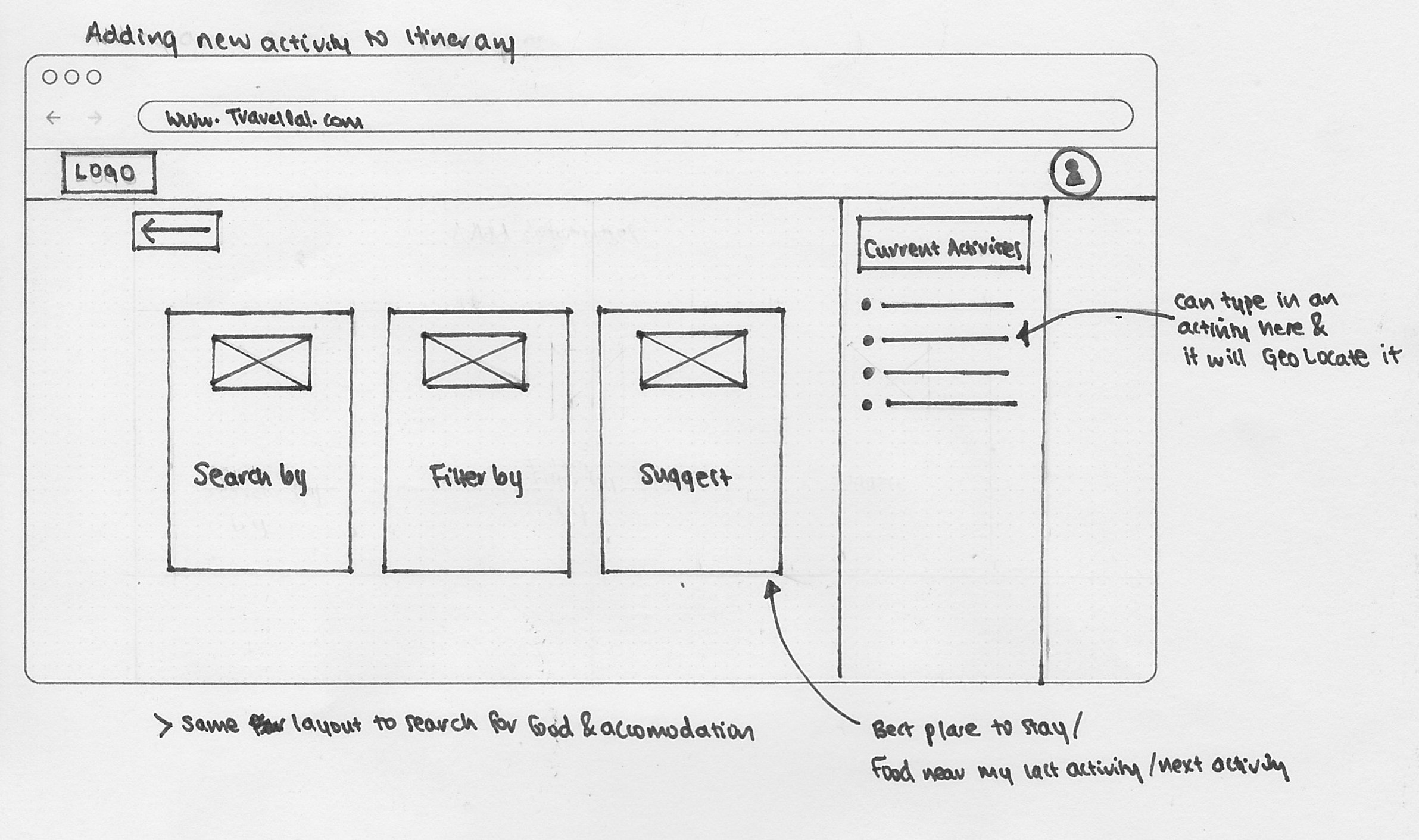
During the wireframing and prototyping stage, I wanted to focus my effort to design and test the core feature of the product with the user. That is, helping the user alleviate planning stress through creating a central research tool for itinerary planning which automatically optimises the users' trip route. A detailed user flow was created to facilitate this.

Detailed user flow which outlines the steps which the user will take from signing up, to researching activities and accommodation, to populating their itinerary
Concept Design
Wireframes & Wireflows
As a first step to the design phase, analogue wireframes were created to visualise the features identified in the MVP.
As competitors' products were evaluated on 'completeness of design', (and having both a web interface and an app was a consideration of this), I created wireframes for both the app and website for my prototype.
Wireflows were developed from the wireframes produced to inform the prototype stage.
Basic wireframes of key pages were developed
%20copy.jpg)
Wireflows were developed using the wireframes created
Initial Prototype
A prototype was developed off the wireframes created. Due to time constraints, the web interface was prioritised for the user testing session, and the mobile app interface was left out for this iteration.
I debated between Adobe XD, Sketch, or UXPin. Having had some familiarity with Adobe XD and Sketch, I decided to use UXPin to build my prototype. One thing I found is that the general features for the software I have used are quite similar, making them all easy to pick up.
Sample screenshots from the first prototype developed
User testing & feedback
I ran a usability testing session with a few testers who fell into the primary persona (planner) group to reveal possible usability problems and collect user feedback.
I walked my testers through a series of 21 tasks which included profile creation, activity and accommodation search, and itinerary creation and optimisation. The user testers provided valuable feedback and insights that I hadn't considered previously or had accidentally left out during initial concept design.
Some key takeaways for the product was that users want:
- To be able to search for activities based on categories
- A 'fun' interface to make itinerary planning 'fun', e.g. a start screen which says 'Welcome to Auckland'
- More user feedback when items are added into their itinerary and when their trip is automatically optimised
- Less text in the user tips which pop up
It is important to note here that although the 21 tasks which I set for my users were quick, it was still a large volume to fit into one testing session, and may have fatigued the testers. It also meant that user feedback was less in-depth towards the end due to time constraints.


Walk-through for user feedback session and feedback collected
Second iteration
While several areas of improvement identified, I focused the second iteration on having one section of the website done well first. This design decision was made as the website is essentially made up of three key sections which follow the same functionality:
- Activity search
- Accommodation search
- Dining search
For this iteration, I focused on the 'activity search' section (See a demo of my prototype below).

From user feedback key areas of improvement were identified for the next iterations

Wireframes for second iteration
Final Prototype
I used Figma for the final prototype.
Having spoke to several product designers and UX designers who told me of this new and increasingly popular program, I decided to challenge myself by teach myself how to use it. Figma is definitely my favourite wireframing, mockup and prototyping program to date!
View live prototype in Figma
Sample screenshots from final prototype developed
key learnings
This was an exciting project that I definitely learnt a lot from.
From undertaking this 10 weeks solo project, some of my key learnings are:
- Through working on my own project, I fell in love with the UX Design process and can definitely see the value which adequate research and planning brings for the rest of the project to inform design
- The limitations of the software chosen meant that the prototype at times could not behave the way I wanted it to. The designs I came up with were sometimes a compromise between what I wanted and what the software could do, which also irritated the testers alike. If taken to a developer to built, I will prototype it the way I intend for it to work, write up a functional specification document and have a proper knowledge transfer session with the developers
- You can't include everyone in your design - otherwise you will design something that satisfies no one and takes too long to build. I hit a road bump during the design process when I found myself trying to cater to the needs of too many types of holiday-goers. While it was useful to identify that travellers fell onto a spectrum of planning, I should have focused my efforts on designing features which my primary persona (planners) required, rather than try to define features that would meet the needs of everyone. More inclusive features should only be considered as the product is developed beyond the MVP.
- Proper prioritisation is an invaluable step that should not be overlooked as the initial MVP defined was more than 'minimum', and the number of features defined was more than what could be produced in the one week timeframe that was set aside for prototyping
Overall, I learnt a lot about the different, yet similar ways, in which people planned their holidays, and how everyone faces the same problem in terms of holiday research, itinerary planing, and trip optimisation. Most importantly, I learnt that I love solving problems which alleviate stress for my users and bring a positive impact to their lives.
30
Screens in first prototype
58
Screens in second / final prototype
"Annie is an amazing designer who is passionate about creating intuitive solutions...Annie did especially well during research, and was able to find insights that not many other people could"
- Vera Kravchuk (Course lecturer at Academy Xi)
Annie Tran © 2019 - 2020 All Rights Reserved